Bank of America: The Best of Banking Websites
To a certain extent, the internet is one of those rare things whose users more frequently utilize its services the younger they are on the age spectrum. According to the Pew Internet and American Life Project, a person that is sixty-five or older has fifty-six percent less of a chance of using the internet than an eighteen to twenty-nine year old person has. With this popularity
 characteristics people look for in a website which concerns their money is security. This website subdues any fears of hackers and identity fraud by placing a sidebar containing three titles: “Our security commitment,” “Fraud prevention tips,” and “Guard against scams.” Those concerned can click on “Our security commitment,” which gives ample information about Bank of America’s Privacy Policy. The website’s creator wrote phrases under certain links regarding the privacy policy to further comfort the hesitant viewer. Two example phrases are “Keeping your financial information secure is one of our most important responsibilities” or “Read about how we manage the privacy and security of your personal and account information online,” which then links customers to much more information. Bank of America was very smart when including this on the home page because if people are concerned, they can read up on how protected they are by their current or potential bank. The links provide answers to many of the questions that would arise in regards to the security of a person’s assets. This information lets customers know that they are not throwing their financial information out into the world without protection.
  people if identity theft has occurred. This concern also shows up in the third sidebar link titled “Guard against scams,” where Bank of America offers “the free Bank of
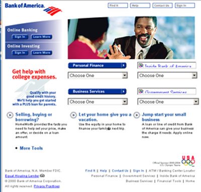
 The website also proves its credibility by the quality of its content and the overall positive experience a user will encounter while searching around. The information provided is helpful to so many. For example, in the top third of the home page is a bar with the titles “Personal,” “Small Business,” and “Corporate & Institutional.” Online banking is not only for dads, moms, or college kids who spent too much money one weekend and need to check their balance. It can be used for such a wide array of needs, which is why this website is so rich in substance. When any one of these titles is clicked on, a half page of subtitles appears below to further your search. Depending on what the viewer is looking for, they can find more in depth information for topics such as Online Banking, Planning for College, Financing your business, Tax services, Investment Solutions, and much more. The Webby Awards use “content” as one of the main criteria in their judging of websites. According to the judging criteria, “Good content should be engaging, relevant, and appropriate for the audience…it always leaves you wanting more.” This content is very relevant and engaging enough where it is not a chore to have to read on.

 cash. Although this might seem like common sense, the authors of the Web Style Guide mention that “It is amazing how often site developers forget that not all communication with the organization goes through the Web site. Even if you have a great Web site, people will still want to call you, send you mail and express packages, and fax you documents.”
The design of the website could also be improved. When the website opens, our eyes are automatically attracted to the biggest and brightest image, which is the advertisement. As we look at the website longer, our eyes start to notice more and more. When looking at the home page, our eyes are distracted from one of the websites prominent features—its diversity. The different groups that the website is trying to attract may not notice that it has something to offer them because their eyes are drawn away from what they really want. Another problem with the design is when the page opens, the subcategories for “Personal” come up. Since the other two topics are written in smaller font at the top of the page, many might not see them and therefore think that online banking only caters to the individual and not the small business or corporation-- which means a loss of business for the bank.
The structure of the website makes it much easier to follow. The home page’s main titles in the top bar are in hierarchal order ascending from the individual to the large corporation. There is a very good consistency among all the pages with a picture or advertisement at the top, many sidebars with links,  and the information in the middle. All pages have a direct link back to the home page, as well as a link to a help page and a page to sign in. According to the Webby Awards judge’s criteria, “Good navigation gets you where you want to go quickly and offers easy access to the breadth and depth of the site's content.” In this case, the navigation got the user to where he or she wants to go in a timely manner, as well as created a “mental model of the information provided, where to find things, and what to expect when you click.” To help a viewer get around, the design and structure are simple enough so someone with limited computer skills will be able to utilize its resources once at the home page. Instead of going for a flashy and elaborate website, Bank of America went for the more basic because in the past “the Web's most successful commerce sites kept things technically simple and basic. Amazon, eBay, Yahoo!, and other successful Web commerce sites use remarkably spare page design schemes and simple text- or tab-based navigation systems.” The examples given are websites that have existed for years and are some of the most efficient as a result.
When the current website is compared to that of 1998 and 2000, it is apparent how much of an emphasis is being placed on the internet and why companies think it is so important to create an efficient and well-rounded website. A company’s website tells the customers and users so much about the quality of the company and its product. A weak website many times will turn off
a potential customer because they will doubt the company’s credibility. Bank of America’s website has the potential to attract new customers to online banking. Internet users will appreciate Bank of America’s emphasis on the security of all customers’ identity and finances—especially at a time when identity theft is so common. Overall, the website was very simple and easy to navigate through. Aside from the tendency of the creator to “chunk” some of the more complicated information, the website was very informative and enabled viewers to learn what Bank of America has to offer. Because of this, it is no surprise that Bank of America was the “Webby Award Winner” and the “People’s Voice Winner” at the Webby Awards for 2006 in the category for “Banking/Bill Paying.”
posted by B- 340 @ 11:09 PM
0 comments
![]()
![]()


0 Comments:
Post a Comment
<< Home